Unlock Deeper Stripe Insights: Introducing Our Free, Client-Side Analytics Dashboard

Free Stripe Analytics Dashboard
This tool was made when we realized that Stripe didn't show the kind of projections and insights we wanted to really dig into. We weren't even looking for anything to make super accurate predictions, but just to enjoy looking at the lines and charts and make some fun projections for the future and different growth rates.
Surprisingly, this tool ended up being pretty useful. It helps with understanding which countries the transactions are coming from, what trend we are seeing with income, where we could potentially see ourselves in a few months, and so on.
This is a free dashboard that runs entirely in your browser. No servers, no data collection, no subscriptions—just a tool that does what we wished existed.
What Makes It Useful
What started as a fun side project turned into something genuinely helpful:
- Privacy first: Your financial data never leaves your browser
- Actually insightful: See patterns and trends that aren't obvious in Stripe's default views
- No barriers: Free to use, no sign-ups or complex setup
- Made by users: Built by people who actually deal with this data regularly
What It Does
Data Import
Upload your Stripe CSV export, paste data directly, or drag and drop. There's sample data if you want to explore first. Everything processes in your browser—your data stays on your machine.
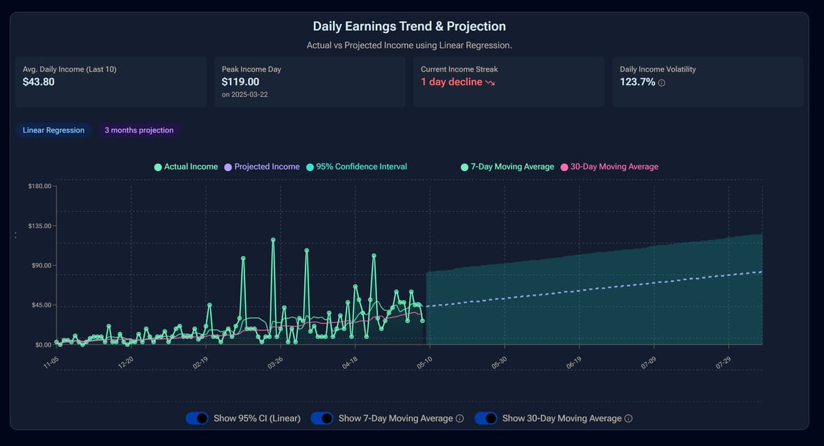
Revenue Projections
Play around with different forecasting methods:
- Linear regression: For steady trends, with confidence intervals
- Polynomial regression: Captures curved growth patterns
- Exponential smoothing: Adapts to recent changes in your data
You can adjust the projection timeframe (3, 6, 12 months, or custom) and add growth rate scenarios to see "what if" situations.
Different Views
- Daily view: Day-by-day breakdown with moving averages
- Weekly view: Smoothed out trends without daily noise
- Monthly view: High-level patterns, great for MRR tracking
- Analysis view: Deeper insights like best/worst days, growth streaks, volatility
- Country map: See where your transactions are coming from geographically
Key Metrics
The dashboard calculates things like MRR, ARR, growth rates, revenue stability scores, and projection confidence. It also identifies patterns like your best day of the week or longest growth streaks—the kind of insights that are interesting to know but hard to calculate manually.
Getting Started
-
Export from Stripe:
- Go to Payments → Export in your Stripe dashboard
- Choose your date range and select "Custom" columns
- Include at least: Created Date (UTC), Converted Amount, Converted Amount Refunded, Status, Card Issue Country
- Optionally add a Cost column if you want profit/ROI analysis
-
Load into the dashboard:
- Upload your CSV, drag and drop, or paste the data
- The tool processes everything automatically
-
Explore:
- Switch between different views and play with projection settings
- See what patterns emerge in your data
Your Data Stays Private
Everything happens in your browser. We don't see your data, store it on servers, or send it anywhere. It's temporarily stored in your browser's local storage for convenience, but you can clear it anytime.
This started as a fun project to make pretty charts from Stripe data, but it turned out to be genuinely useful for understanding business trends. Give it a try and see what insights your data reveals.